By: Jenny Schuetz, Arturo Gonzalez, Jeff Larrimore, Ellen A. Merry, and Barbara J. Robles1
In the U.S., geography has long been viewed as a proxy for income and race. The terms central city or “inner city” are often used as a short-hand for poor and minority neighborhoods, particularly African-American, while suburban dwellers are assumed to be affluent and white (Jargowsky 1997; Wilson 1987). However, since the 1990s, researchers have documented two related trends that counter these assumptions: gentrification of centrally located neighborhoods and the “suburbanization of poverty” (Baum-Snow and Hartley 2016; Couture and Handbury 2016; Ellen and O’Regan 2008; Ellen and O’Regan 2011; Kneebone and Holmes 2016; McKinnish, Walsh and White 2010). These demographic shifts raise the question: in U.S. metropolitan areas today, are centrally located neighborhoods more likely to be poor and majority non-white?
To answer this question, we analyze the correlations between within-city location and neighborhood income and racial composition for four large metropolitan areas: Atlanta, Detroit, Los Angeles and Washington DC.2 These four areas were chosen because they have different underlying spatial patterns and varying racial/ethnic composition. The center of each metropolitan area, or Central Business District (CBD), is identified here as the location of City Hall for the primary central city. Using tract-level data from the American Community Survey from 2009-2014, we estimate locally-weighted regressions that show how household income and the neighborhood share of black, Hispanic and Asian residents vary with distance to the CBD. We also calculate the share of non-white residents living within certain distance bands of the CBD, relative to the overall population.
Results suggest a more complex reality than the stereotype of poor, minority cities and rich, white suburbs. On average, neighborhoods near the CBD do have lower incomes and higher non-white population shares. However, in most metropolitan areas, both central city and suburban neighborhoods are economically and ethnically diverse. These results have important implications for spatially targeted policies aimed at poverty alleviation and community economic development.
Central cities include poor and wealthy neighborhoods
Distance from the CBD is not a consistent predictor of neighborhood income. Figure 1 illustrates the correlation between income and distance for each metropolitan area. In each graph, the black line shows the locally smoothed regression, while individual tracts are shown in the scatterplots, colored by income quartile from red (poorest) to light gray (richest). In Atlanta, neighborhood income is essentially uncorrelated with distance to the CBD: the regression line shows average income slightly above $50,000 across most distance ranges. By contrast, in Detroit and Los Angeles, neighborhood income increases steadily moving away from the CBD. The relationship between income and space in Washington is the most complex, with a cluster of high income neighborhoods within five miles of the CBD and others approximately 15-20 miles away. Neighborhoods within 5-10 miles of the CBD are less affluent than closer-in tracts or those further away.
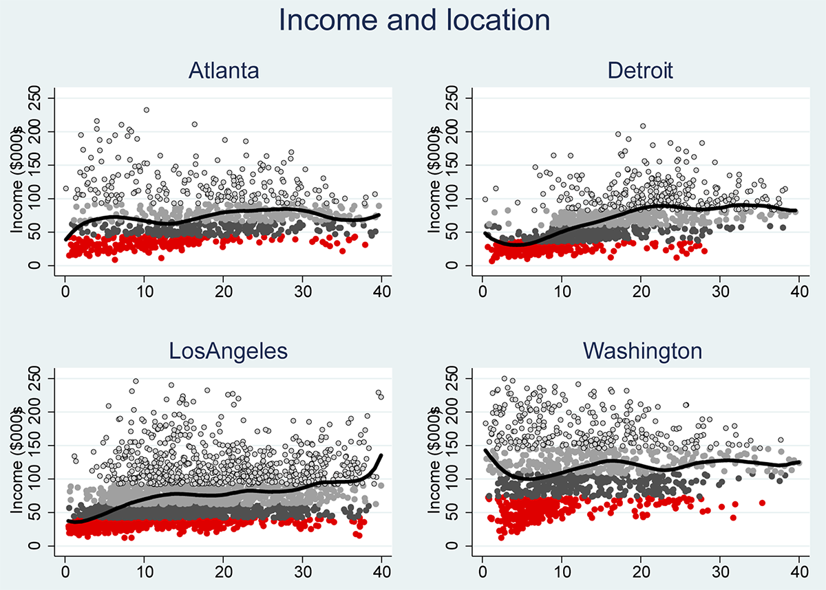
Notes: The black lines are locally smoothed regressions, showing the relationship between median household income and distance to the CBD. The scatterplot shows individual tracts, colored by income quartile within the MSA (red is the lowest income, light grey is the highest). Distance from CBD calculated using location of City Hall, obtained from Google maps (October 2016). Income from United States Census Bureau/American FactFinder. “S1901 : Income in the Past 12 Months (in 2014 Inflation-Adjusted Dollars).” 2010 – 2014 American Community Survey. U.S. Census Bureau’s American Community Survey Office, 2014. Web. November 2016 .
The tract-level scatterplots also illustrate the level of income dispersion within given distance bands. For instance, looking at tracts within 10 miles of the CBD, which can be thought of as the central urban core, Atlanta and Washington have considerable income diversity, with numerous tracts from all four income quartiles represented. In Los Angeles, tracts within five miles of the CBD are almost exclusively the lowest two income quartiles. Detroit shows the greatest spatial income segregation: most of the poorest tracts are within 10 miles of the CBD, while most high-income tracts are more than 20 miles from the CBD.
Central city and suburban neighborhoods are ethnically diverse
The relationships between location and neighborhood racial/ethnic composition also vary considerably across metropolitan areas (Figures 2-4). Black population shares decline with distance from the CBD for all four MSAs, but with notably different shapes and slopes (Figure 2). In Atlanta, for example, there is a consistent correlation between distance and black population share: African-American share decreases by about 5-7 percentage points for each five miles further the neighborhood is from the CBD. For comparison, in Washington DC, the black population share is lower near the CBD than in the 5-10 mile range.
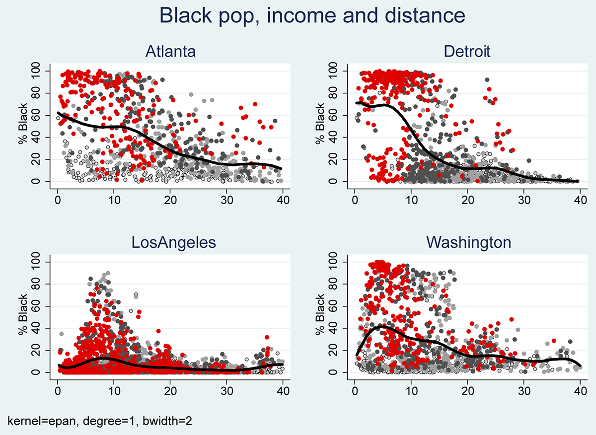
Sources: The black lines are locally smoothed regressions, showing the relationship between black population share and distance to the CBD. The scatterplot shows individual tracts, colored by income quartile within the MSA (red is the lowest income, light grey is the highest). Distance from CBD calculated using location of City Hall, obtained from Google maps (October 2016). Income from United States Census Bureau/American FactFinder. “S1901 : Income in the Past 12 Months (in 2014 Inflation-Adjusted Dollars).” Black population share from “B03002 : Hispanic or Latino Origin By Race.” 2010 – 2014 American Community Survey. U.S. Census Bureau’s American Community Survey Office, 2014. Web. November 2016 .
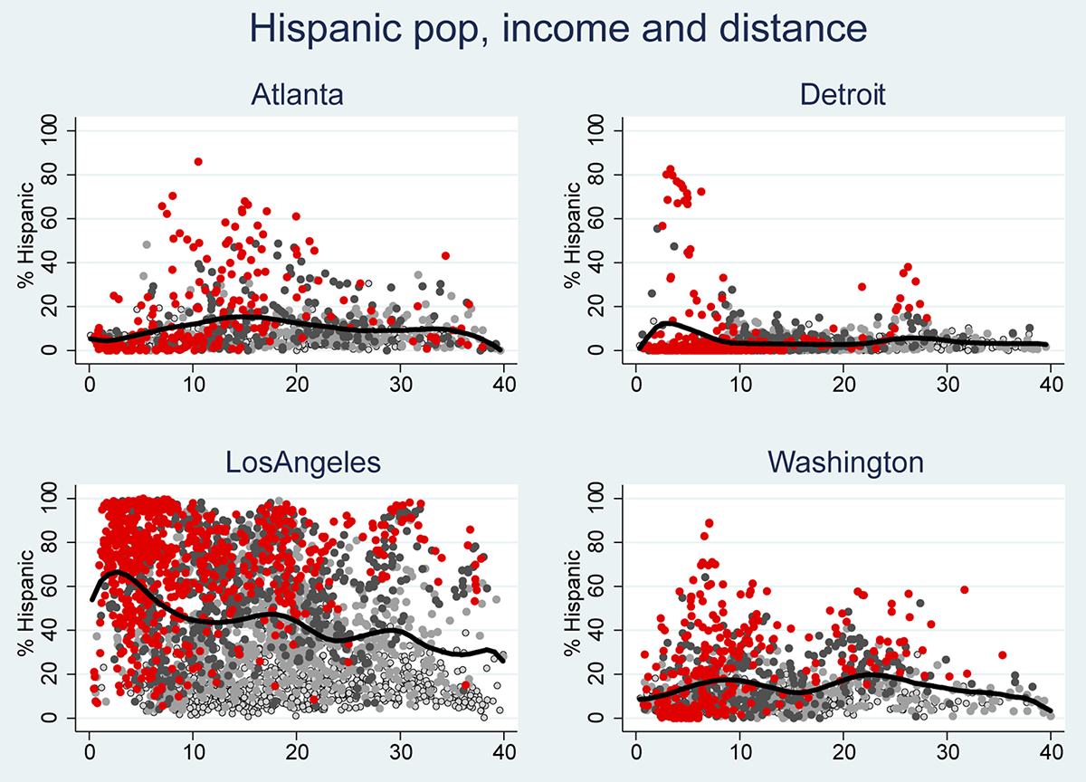
Sources: The black lines are locally smoothed regressions, showing the relationship between Hispanic population share and distance to the CBD. The scatterplot shows individual tracts, colored by income quartile within the MSA (red is the lowest income, light grey is the highest). Distance from CBD calculated using location of City Hall, obtained from Google maps (October 2016). Income from United States Census Bureau/American FactFinder. “S1901 : Income in the Past 12 Months (in 2014 Inflation-Adjusted Dollars).” Hispanic population share from “B03002 : Hispanic or Latino Origin By Race.” 2010 – 2014 American Community Survey. U.S. Census Bureau’s American Community Survey Office, 2014. Web. November 2016 .
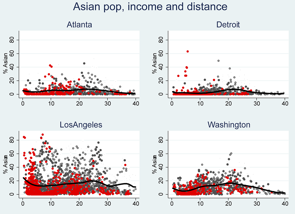
Sources: The black lines are locally smoothed regressions, showing the relationship between Asian population share and distance to the CBD. The scatterplot shows individual tracts, colored by income quartile within the MSA (red is the lowest income, light grey is the highest). Distance from CBD calculated using location of City Hall, obtained from Google maps (October 2016). Income from United States Census Bureau/American FactFinder. “S1901 : Income in the Past 12 Months (in 2014 Inflation-Adjusted Dollars).” Asian population share from “B03002 : Hispanic or Latino Origin By Race.” 2010 – 2014 American Community Survey. U.S. Census Bureau’s American Community Survey Office, 2014. Web. November 2016 .
The different correlations between distance and black population share can be further observed through the scatterplots of individual tracts. In Atlanta, Detroit, and Washington DC, there is considerable dispersion of the black population share among the tracts within 5 miles of the CBD – with the black population shares ranging from under 20 percent to well over 80 percent. But, in contrast to the other cities, Detroit exhibits almost a bimodal pattern, as these central tracts have black populations either above 70 percent or below 30 percent but very few are racially integrated. The relationship between distance, black population share, and income can also be observed together using the colors in the scatterplots, with red tracts representing the lowest income tracts and light gray representing the highest income ones. In all four MSAs, the lowest income tracts have an above average black population share, and this is most pronounced in Atlanta and Detroit. However, all four MSAs also have low-income tracts with very low black population shares.
The spatial patterns of ethnicity across MSAs are quite different when looking at neighborhood Hispanic population shares (Figure 3). In Los Angeles, which has by far the largest Hispanic population of the four MSAs, Hispanic population share clearly declines with distance to the CBD. Los Angeles also has substantial dispersion of ethnic composition among tracts at all locations: distance is strongly predictive of Hispanic population share, but with high variance. The other three cities each have fewer highly Hispanic tracts than Los Angeles as well as different locations of these tracts. Atlanta and Washington DC have slightly parabolic graphs, with the greatest concentration of Hispanic neighborhoods located between 5 and 15 miles from the CBD, whereas in Detroit the relationship is nearly flat with a small cluster of heavily Hispanic tracts around four miles from the city center. The income scatterplot shows that most of the poorest tracts in Los Angeles are heavily Hispanic, although here again there is substantial variation. One-sixth of the majority Hispanic districts in Los Angeles are in the top two income quintiles. In the other three MSAs, some of the poorest tracts are highly Hispanic, but most poor tracts are largely non-Hispanic – which in part reflects the lower share of the population that is made up of Hispanics in these cities.
While predominantly black and Hispanic tracts tend to have below-average income and be clustered near the CBD, Asian population shares are positively correlated with income and essentially uncorrelated with distance to CBD (Figure 4). In Washington, the tracts that are at least 15 percent Asian are also mostly affluent and suburban, although there are some poor tracts with relatively high Asian concentrations. In Los Angeles, which has the largest overall Asian population, Asian-dominated tracts are economically diverse and scattered throughout the metropolitan area. The most concentrated tracts are around 80 percent Asian, and highly Asian neighborhoods are found in every income quartile and at all distances from the CBD. Unlike both Los Angeles and Washington DC, neither Atlanta nor Detroit have substantial numbers of tracts with large Asian populations, as the tracts in these MSAs are, on average, less than 10 percent Asian.
African-Americans are more concentrated in urban cores than Hispanics or Asians
Because the racial/ethnic composition of the MSAs differs so widely, it is somewhat difficult to interpret the degree of racial concentration across cities. For a more comparable presentation, Figure 5 shows the share of each MSA’s total population, as well as the population by racial/ethnic group living within certain distances of the CBD. We divide tracts into three distance bands: the central urban core (0-10 miles), inner ring suburbs (10-20 miles), and outer ring suburbs (more than 20 miles). We then aggregate the share of each MSA’s total population by black, Hispanic and Asian populations living within each ring. Across the four MSAs, Washington has the most centralized population (about 40 percent within 10 miles) and Atlanta’s population is least centralized (less than 20 percent within 10 miles, nearly 50 percent beyond 20 miles).
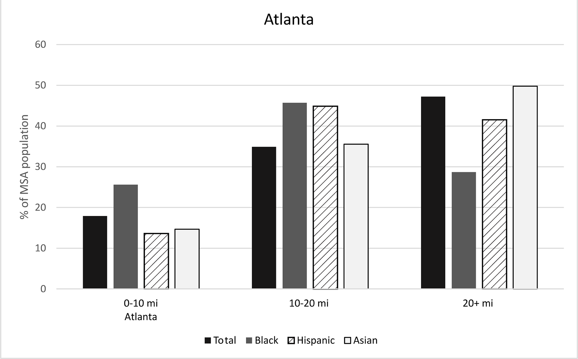
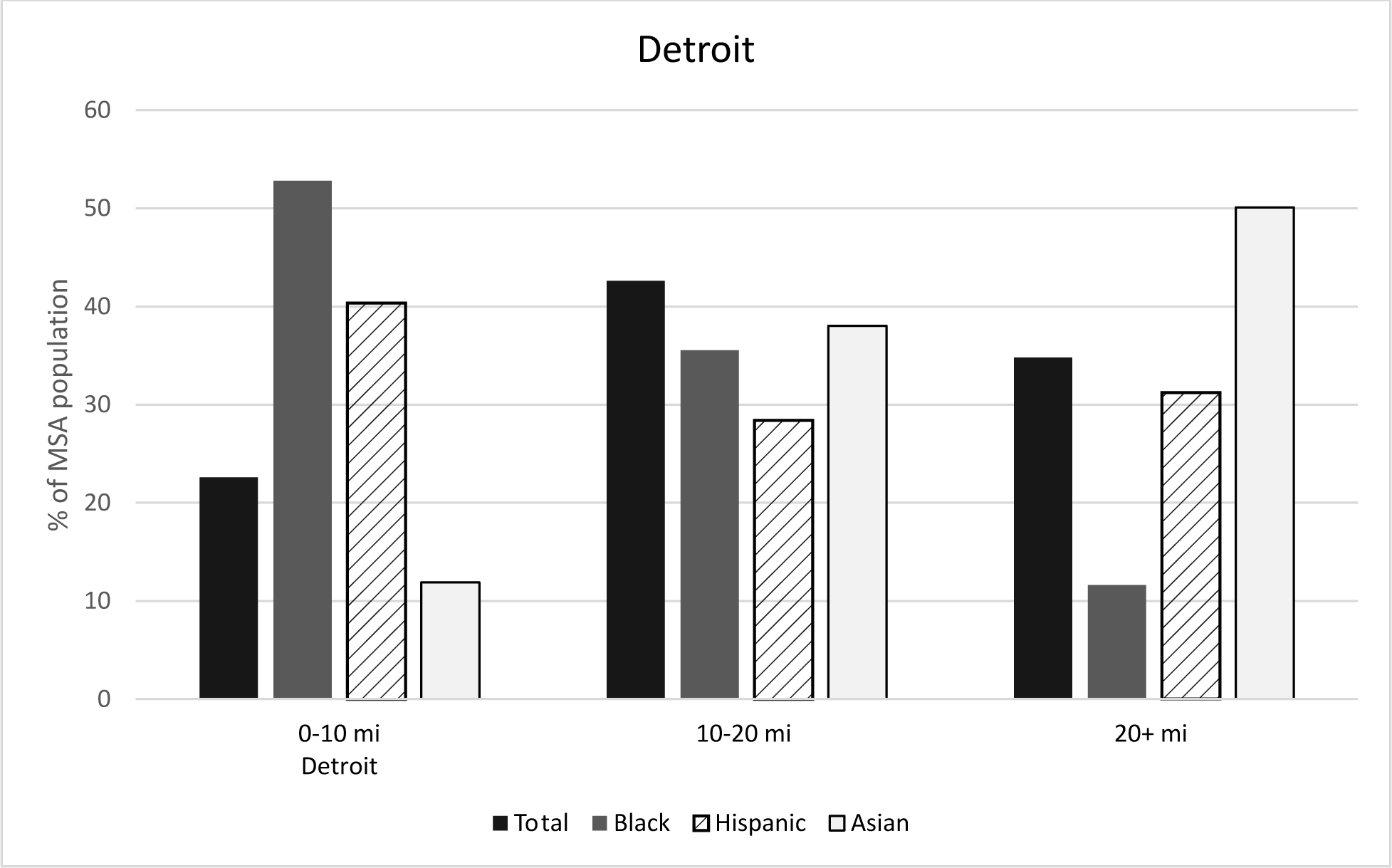
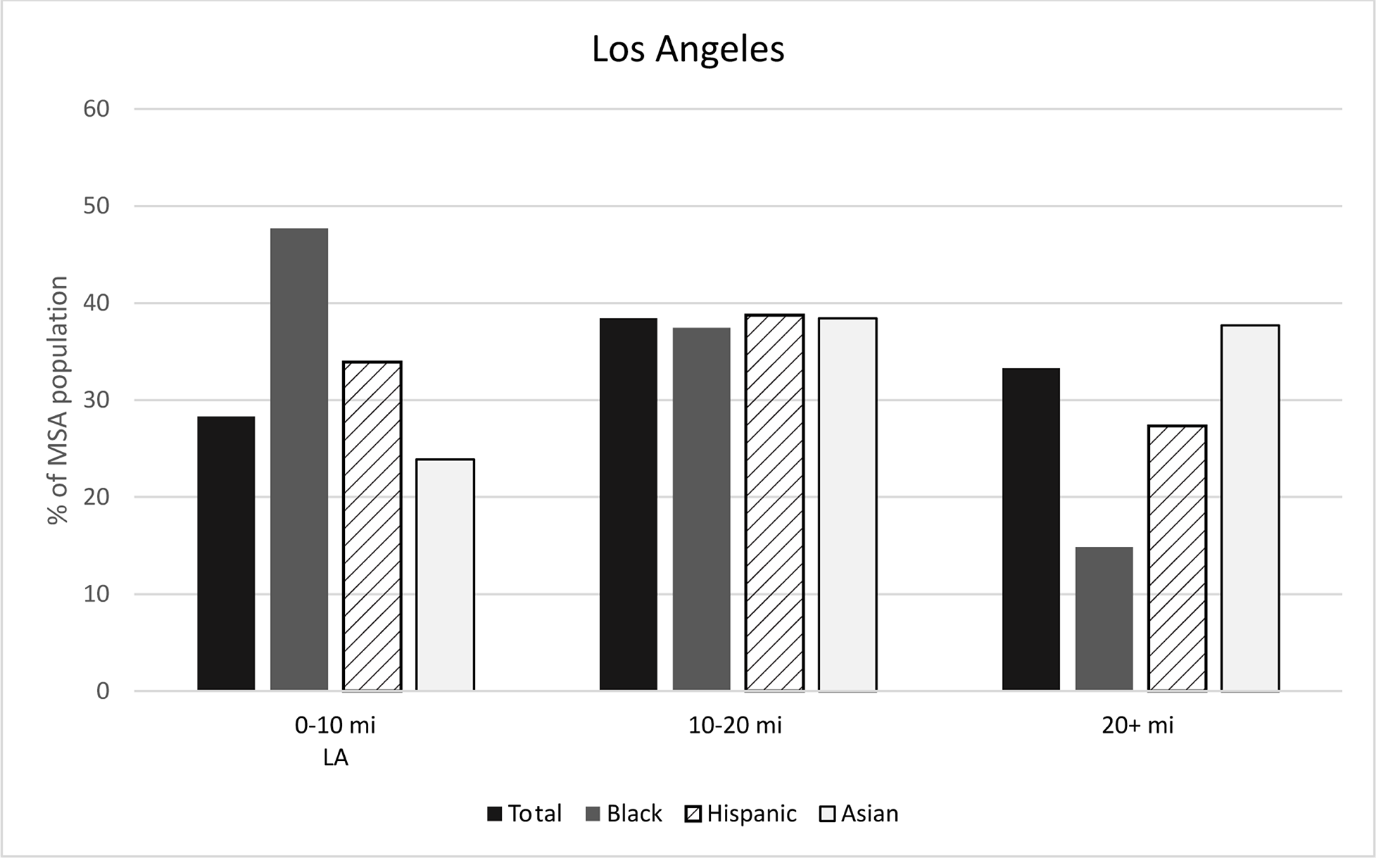
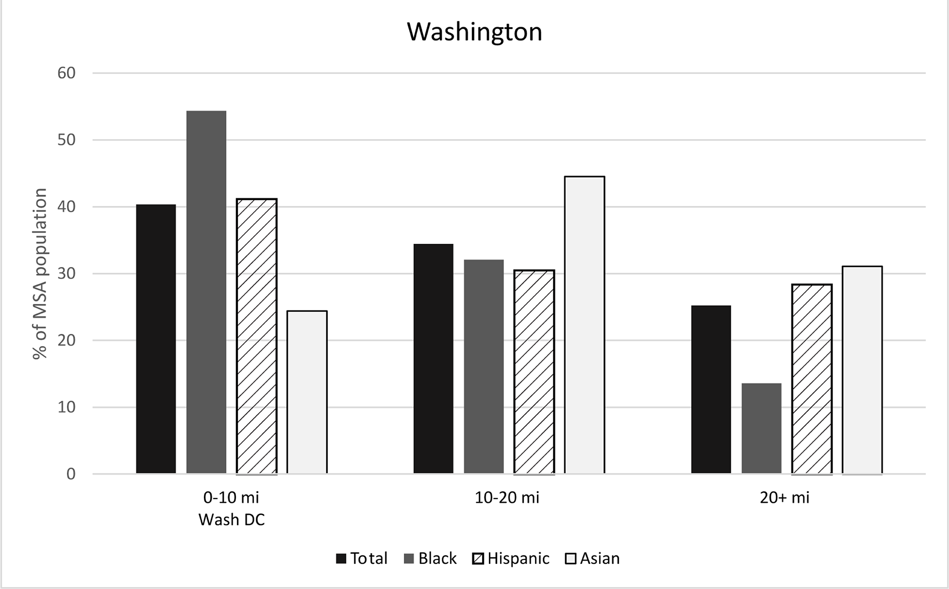
Note: Columns show percent of MSA population by racial/ethnic group. Distance from CBD calculated using location of City Hall, obtained from Google maps (October 2016). Income from United States Census Bureau/American FactFinder. “S1901 : Income in the Past 12 Months (in 2014 Inflation-Adjusted Dollars).” Black, Hispanic and Asian population shares from “B03002 : Hispanic or Latino Origin By Race.” 2010 – 2014 American Community Survey. U.S. Census Bureau’s American Community Survey Office, 2014. Web. November 2016 .
Comparing the three ethnic groups, blacks are most likely to live within the urban core in all four MSAs, and Asians are most likely to live in the outer ring suburbs, though the size of differences varies across cities. Atlanta has the smallest differences in degree of centralization of its black residents (top left) whereas the black population in Detroit is quite concentrated in the urban core relative to its overall population. Unlike that seen for either the black or Asian populations, the level of concentration among Hispanics in the urban core does not follow a consistent pattern across the four cities. In Detroit and Los Angeles, Hispanics are somewhat over-represented in the urban core relative to the overall population, in Atlanta they are underrepresented there, and in Washington DC the share of Hispanics in the urban core roughly matches the overall population share living that close to the CBD. Despite these differences, overall Figure 5 shows that racial/ethnic clustering near the CBD is substantially more prevalent for blacks than Hispanics or Asians, regardless of the overall MSA racial/ethnic composition.
Discussion
Understanding spatial patterns of income and race has several important policy implications. Economic opportunities and amenities vary across space; where households live affects their access to employment centers, transportation infrastructure, local public schools, health care facilities, and environmental quality. Concentration of low-income families within a city or county can impact the local government’s tax base and ability to provide services. Some federal and state programs intended to assist economic development or poverty alleviation are allocated using spatial guidelines. Programs such as Community Development Block Grants (CDBG), Low Income Housing Tax Credits (LIHTC), and New Markets Tax Credits channel funding into distressed areas for affordable housing, job training, support for entrepreneurs and small businesses, and other community and economic development goals. The geographic definitions used to determine program eligibility vary by program; for instance, CBDG funds are allocated to states and large local governments, with considerable discretion on where they are used within jurisdictions, while LIHTC projects have usage guidelines by census tract status. Our results suggest that the geographic level and definition of targeting will have different implications for reaching poor households. Large cities and urban counties certainly contain many poor neighborhoods and a sizeable share of the nation’s low-income households, but many lower-income and minority households and neighborhoods are located outside of these political jurisdictions. In particular, lower-income and minority neighborhoods that are outside incorporated cities (i.e. unincorporated county areas) may be less visible than urban constituencies with similar economic need.
References
Baum-Snow, Nathaniel and Daniel Hartley. 2016. Gentrification and Changes in the Spatial Structure of Labor Demand. Working paper.
Couture, Victor and Jessie Handbury. 2016. Urban Revival in America, 2000 to 2010. Working paper.
Ellen, Ingrid Gould and Katherine O’Regan. 2008. Reversal of Fortunes? Low Income Neighborhoods in the 1990s. Urban Studies 45(4): 845-869.
Ellen, Ingrid Gould and Katherine O’Regan. 2011. How Neighborhoods Change: Entry, Exit and Enhancement. Regional Science and Urban Economics 41(2): 89-97.
Jargowsky, Paul. 1997. Poverty and Place: Ghettos, barrios and the American city. New York: Russell Sage Foundation.
Kneebone, Elizabeth and Natalie Holmes. 2016. U.S. Concentrated Poverty in the Wake of the Great Recession. Brookings Institution: Metropolitan Policy Program working paper.
McKinnish, Terra, Randall Walsh and T. Kirk White. 2010. Who gentrifies low-income neighborhoods? Journal of Urban Economics 67(2): 180-193.
Schuetz, Jenny, Arturo Gonzalez, Jeff Larrimore, Ellen Merry and Barbara Robles. 2017. Are Central Cities Poor and Non-White? Finance and Economics Discussion Series 2017-1955. Washington: Board of Governors of the Federal Reserve System.
Wilson, William Julius. 1987. The Truly Disadvantaged. Chicago: University of Chicago Press.
1. The analysis and conclusions set forth are solely the responsibility of the authors, and do not indicate concurrence by the Board of Governors of the Federal Reserve System. We thank Christina Park and Anna Tranfaglia for excellent research assistance. Return to text
2. This Note summarizes findings from a longer working paper (Schuetz et al 2017). More details on methodology and full results are available at: https://www.federalreserve.gov/econres/feds/files/2017031pap.pdf. Return to text
Please cite this note as:Schuetz, Jenny, Arturo Gonzalez, Jeff Larrimore, Ellen Merry, and Barbara Robles (2017). “Are Central Cities Poor and Non-White?,” FEDS Notes. Washington: Board of Governors of the Federal Reserve System, May 15, 2017. https://doi.org/10.17016/2380-7172.1982.
Disclaimer: FEDS Notes are articles in which Board economists offer their own views and present analysis on a range of topics in economics and finance. These articles are shorter and less technically oriented than FEDS Working Papers.